CatSalut
AproposedappfortheCatalanPaediatricService,submittedbyQuantiontoaCatSalutpublictender.Architecture,wireframes,prototypesandstyleguide,doneinaweek.
(SCROLL) ↓
01
Project Overview
A paediatric service for the whole family.
Families with young children juggle appointments, reports, emergencies and paperwork, often for more than one child. CatSalut’s tender called for an app for the Catalan Paediatric Service that brought it all together, with secure access and a profile for each child. I joined the Quantion team with the proposal already under way and, in one week, delivered the architecture, wireframes, prototypes and style guide.
Fitxa
RoleUI/UX Designer
Year2021
SectorPublic Health
ClientCatSalut · Generalitat de Catalunya
AgencyQuantion


02
User Experience
Every task, on a single map.
Before drawing a single screen I mapped the whole service: access with DNI, CIP or digital certificate, choosing the child, La Meva Salut, calendar and appointment manager, eConsulta, medical directory, paediatric emergencies and Canal Salut. Every branch had its decisions (first access, more than one profile, an appointment to repeat), so the technical document explained how the app would work, not just how it would look.
My contribution
- Information architecture: a flow diagram of the whole service, from log-in to the FAQs.
- Profile management: choosing the child on entry and switching profile from the header of every screen.
- Access: DNI or CIP with a password, or a digital certificate.
- Navigation: a menu with the service’s eight sections and a search.


03
Prototyping
Desktop and mobile for every screen.
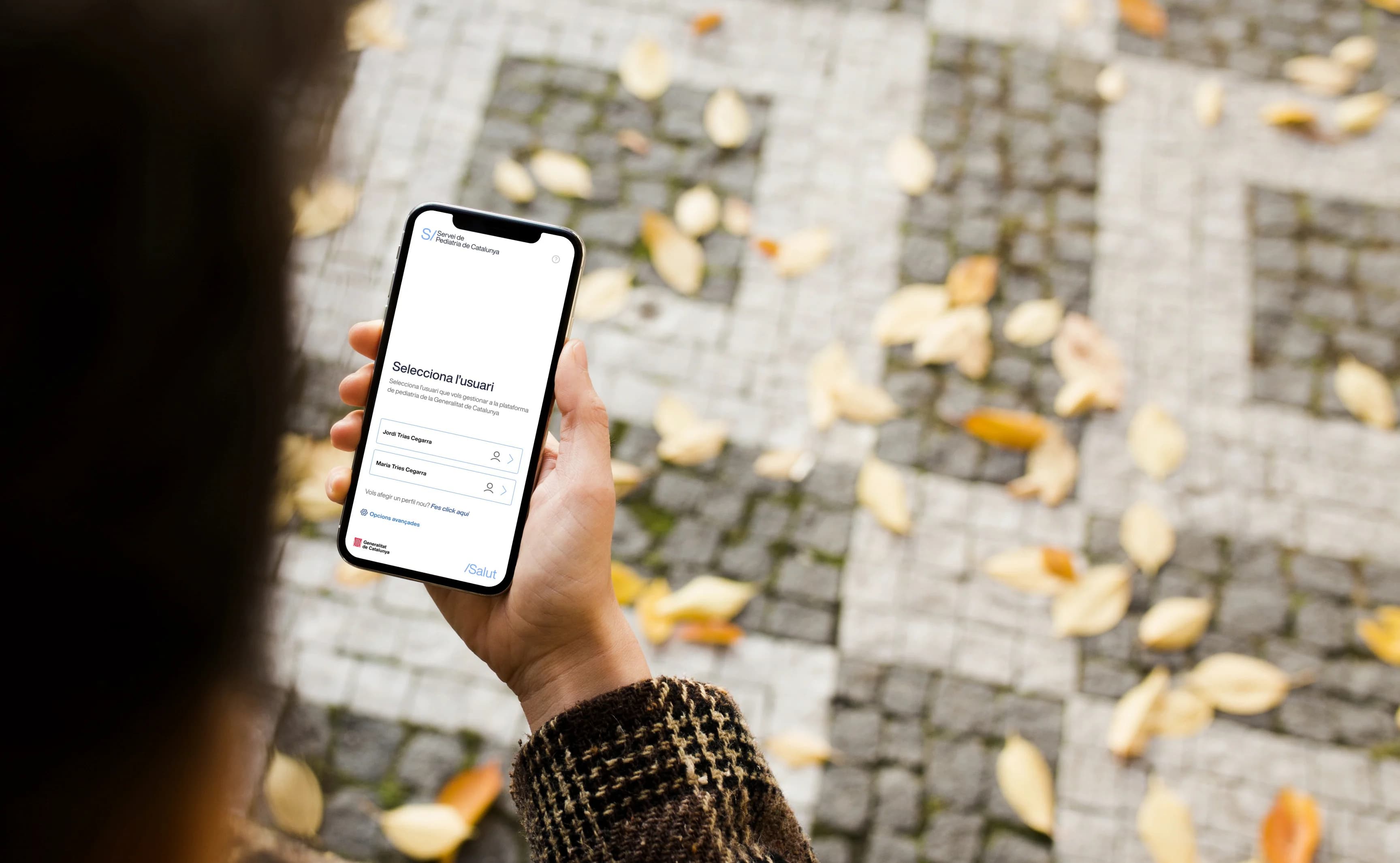
With the architecture settled, each section became a wireframe on desktop and mobile, and from there clickable prototypes, animated intro included. Screens were annotated component by component (header, alerts, hospital cards, map, footer) so the tender panel could follow every decision just by reading the document.
My contribution
- Wireframes: every section of the service, on desktop and mobile.
- Prototypes: welcome, log-in and user selection, with the animated logo intro.
- Annotated screens: every component explained beside the screen, for the technical document.


04
UI Design
Built on the Generalitat’s guidelines.
The app had to be recognisable as a Generalitat service. I started from its visual identity guidelines, with Helvetica Now Display, and adapted them to an interface that’s often used in a hurry: primary blue for actions, an alert scale for notices, white cards on a light background and the child’s profile always in view.
My contribution
- Style guide: architecture, colours, typography, buttons, alerts, forms and navigation in a single document.
- Components: appointment, hospital and report cards, a calendar and reusable forms.
- Paediatric emergencies: a card for each hospital with opening hours highlighted and the map.


Quantion’s proposal wasn’t awarded. But it was delivered on time and in full, with the architecture, prototypes and style guide the tender required, and it opened the door for me to the agency’s next projects.

Share this project
Keep scrolling to see the next case study.
PADLL