More Empordà
LandingpageforanEmpordàcompanythatmanagessecondhomesontheCostaBrava:maintenance,supervisionandservicesduringeachstay.Itstartedasafour-pagewebsiteandendedupasasinglepage.
(SCROLL) ↓
01
Project Overview
A home that’s ready without you having to be there.
Anyone with a second home on the Costa Brava lives far from it most of the year: the garden, the pool, the cleaning and any incidents have to be coordinated remotely, with several professionals and several invoices. More Empordà brings it all together under a single point of contact. I designed the landing page and its component system, and built it in code with Next.js and AI assistance, in four languages.
Fitxa
RoleUI/UX Design & Front-end
Year2026
DisciplineLanding Page
SectorProperty Management
Websitemoreemporda.com


02
User Experience
From four pages to a single landing page.
The project started as a four-page website, with the architecture and SEO copy for each page already written. But a new business with a single service fitted on one page, and that kept the contact form one scroll away. The content was reordered as an argument: what More Empordà does, how it works, what the owner gains and which problems it solves.
My contribution
- Architecture and SEO: sitemap, title tags, meta descriptions and keywords for every page before designing any of them.
- Move to a landing page: the content of four pages in a single journey that ends at the contact form.
- Problems and solutions: five concerns of an owner who lives far away, each with its answer.
- Four-step process: from the first visit to the monthly report, so the client knows what will happen before getting in touch.


03
Prototyping
Three screen sizes from the start.
Every screen was drawn for desktop, tablet and mobile, for both the website and the landing page. That’s why the change of scope didn’t mean starting from scratch: the website sections could be reused as landing page blocks, already solved at all three sizes.
My contribution
- Wireframes in three sizes: desktop, tablet and mobile for every screen of the website and the landing page.
- Carousels per device: the experiences and the management services, solved as a slider at each size.
- Four languages: Catalan, Spanish, English and French, deployed with Next.js.


04
UI Design
The Empordà as a promise of peace of mind.
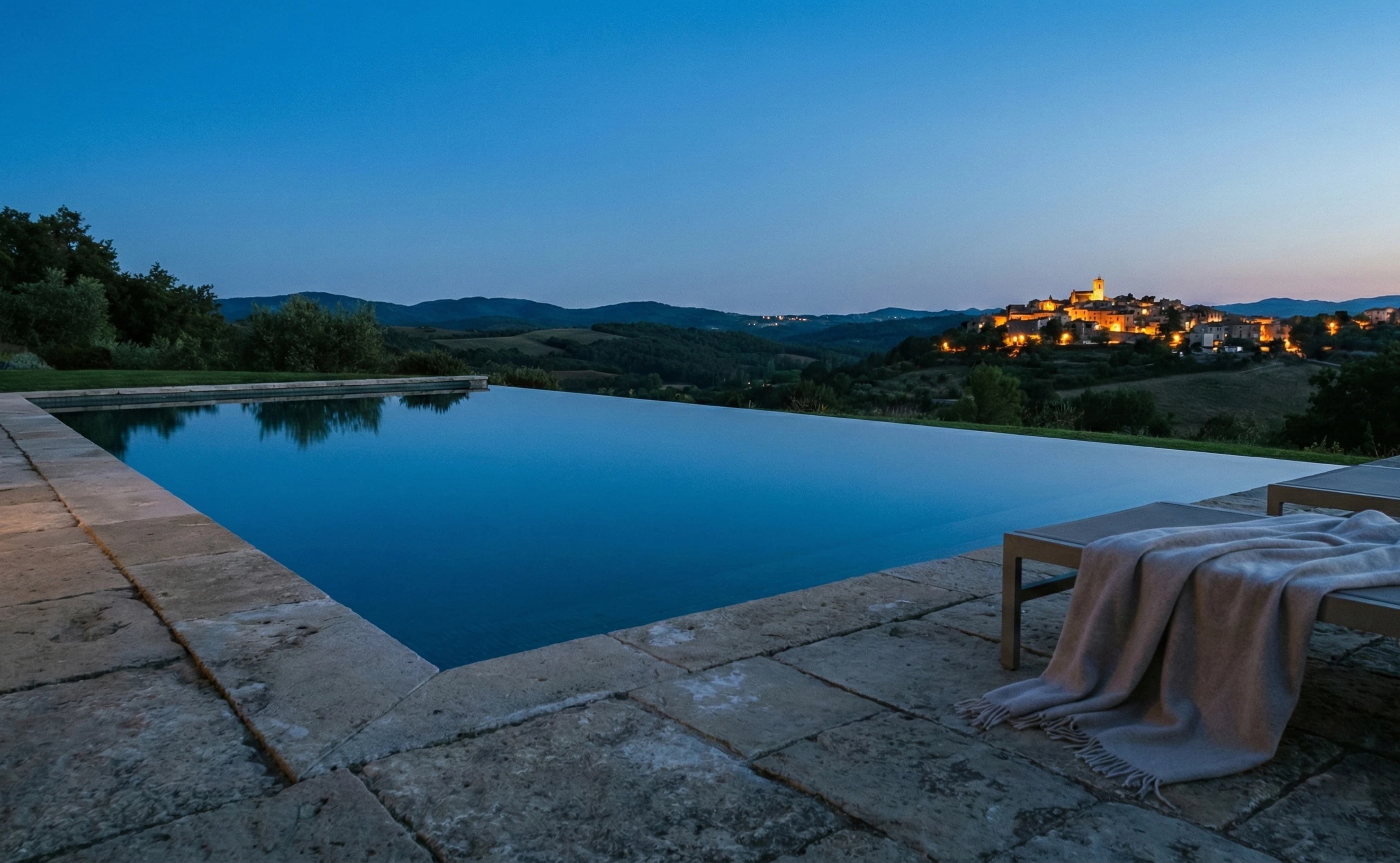
The owner isn’t buying maintenance, they’re buying not having to think about it. The interface says so with large photography of the region, a palette of earth, olive and stone tones, Mont for headlines and Montserrat for body text, and plenty of space between sections. A system of components and variables for three screen sizes holds the whole page together.
My contribution
- Design system: typography, colours, spacing, shadows and buttons as variables, with modes for mobile, tablet and desktop.
- Image bank: photography organised by management, sea, activities, food and wellness.
- Components: navbar, footer, buttons and the experience and management carousels, reusable across the page.


More Empordà has a single page that explains what it does, how it does it and why the owner can switch off, in four languages. And the content of the original website stays written and structured in case the landing page ever needs to grow.

Share this project
Keep scrolling to see the next case study.
Segurall